In summer 2018, one evening, few people were marketing about some service, at the entrance of our building. While I tried to avoid eye contact and pass through, a person called me politely “Sir may I have your 2 minutes”. Well, in the next 2 minutes the gentleman convinced me thoroughly to use the service, it was an impressive pitch, at the right place and the right time. After reaching home, I downloaded the app but for the next one hour I was lost in resolving the riddle. I was promised daily need groceries by the salesperson but what I got was spaghetti.
Raincan is a Pune (India) based startup, who delivers daily need products like milk, bread, fruits or any sort of grocery at customer doorstep. The good thing about Raincan is, as a user you don’t have to place an order every week instead, users can select products, set frequency, select delivery time and goods are delivered at your doorstep. This is very useful in case of milk and dairy products (but not limited to) as a large number of Indian people consume milk and other dairy products on a regular basis.
At first look, the app looked like a rough idea put together by the team, without thinking much about design. Sometimes one has to figure out and get used to the poor design if the value of an idea is great, and there is no other alternative.
I had a detailed look at the app and also gathered the feedback from few of my friends, who were the real app users. Below is the list of few areas of improvement I identified:
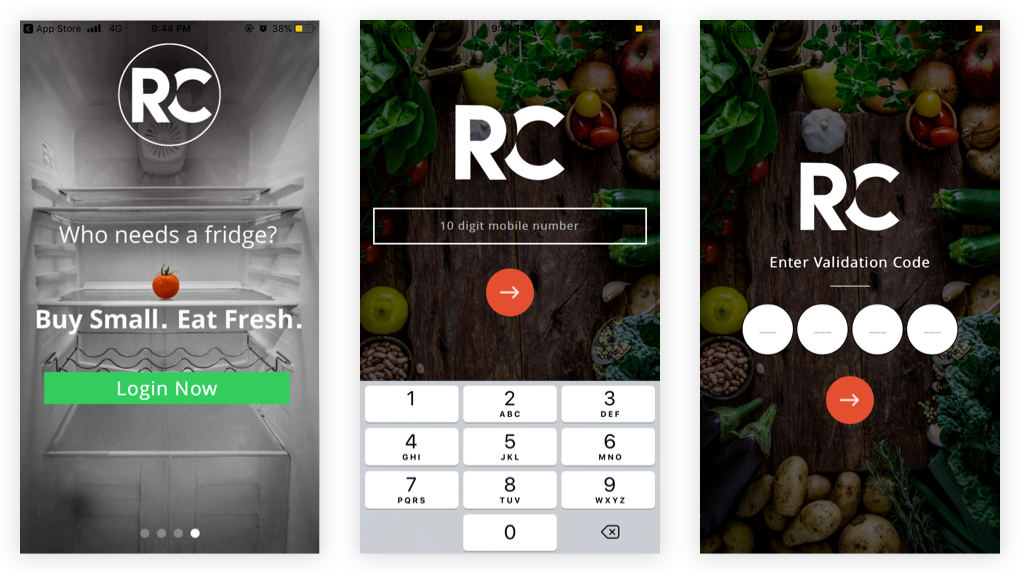
Onboarding was straight forward, user enters his mobile number and validates via OTP. Only thing I complain about is lots of apps that force users to sign up upfront, without even showing true value and offerings. Raincan had the same experience. Users have to sign up without even knowing what categories, products and brands they are having.
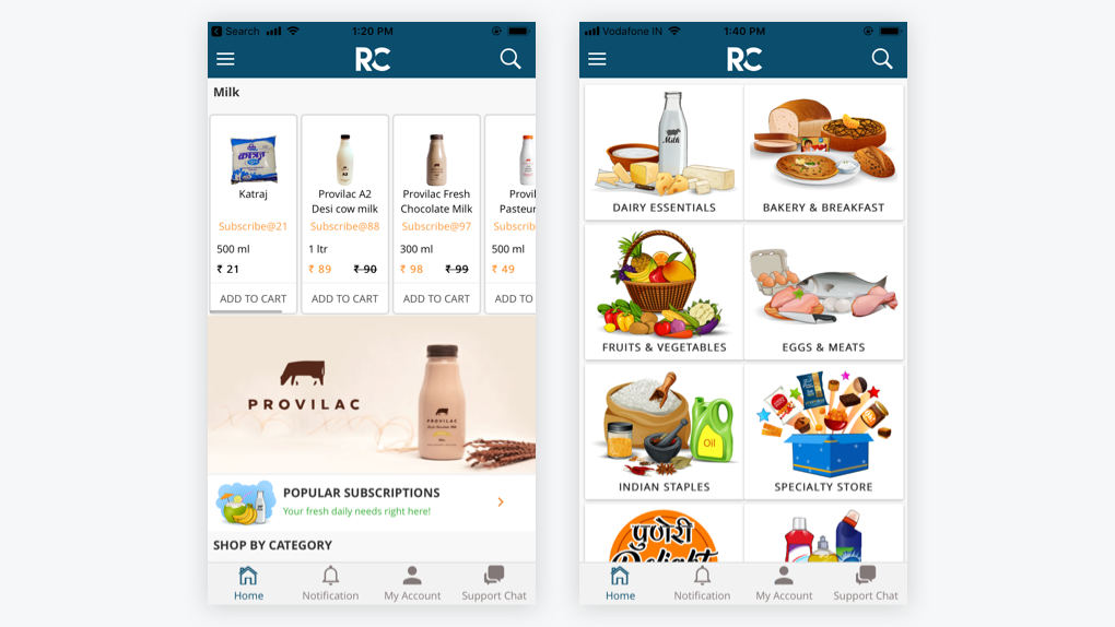
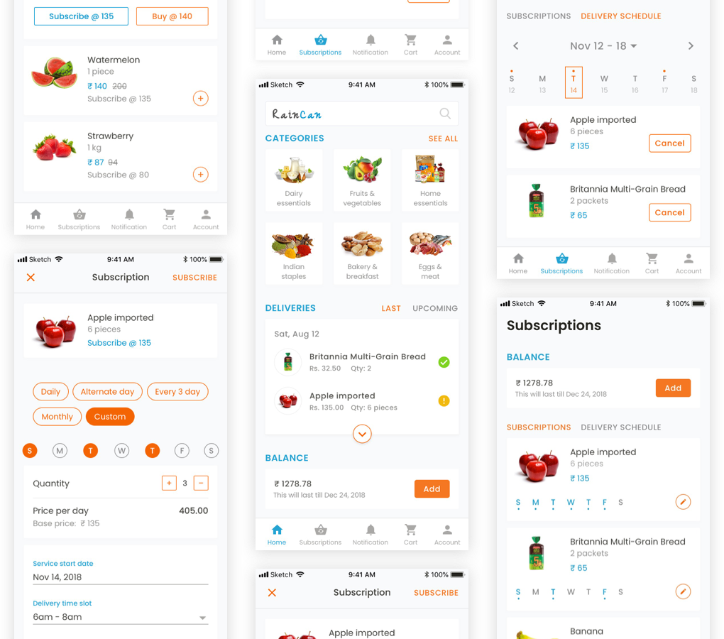
At first look, visuals didn’t look appealing, everything looked so congested, not much white space. Milk, as expected, had a priority 1 product, which occupied almost 80% of the screen, which didn’t look the correct way to go. Here are a few of my findings from home page:
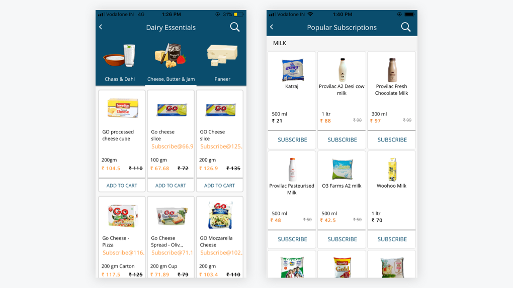
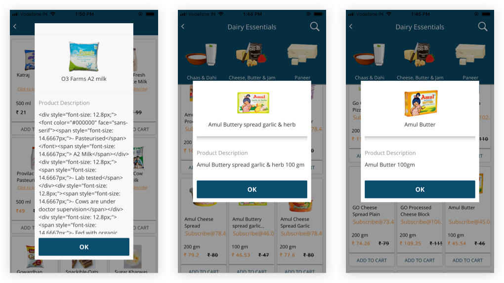
It is well said by someone less is more but that’s not the case with the Raincan product listing page. They have tried to shove 9 results in one view. One major problem I see with this page is, product cards are not consistent across the app.
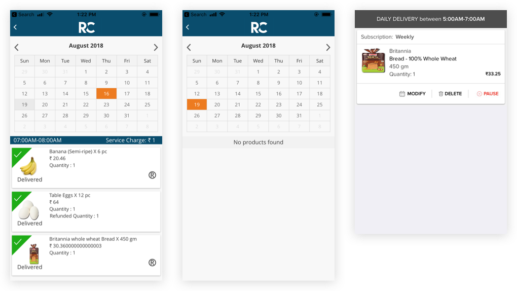
There is no way for users to tell on what day a delivery is scheduled. The calendar does not show upfront if anything is getting delivered on a specific day. User has to select a date to see what’s inside.
When it comes to daily need products lots of users are very conscious about ingredients and nutrition information. Having those would be a good value addition. A dialog box does not seem to be an ideal choice to show these details.
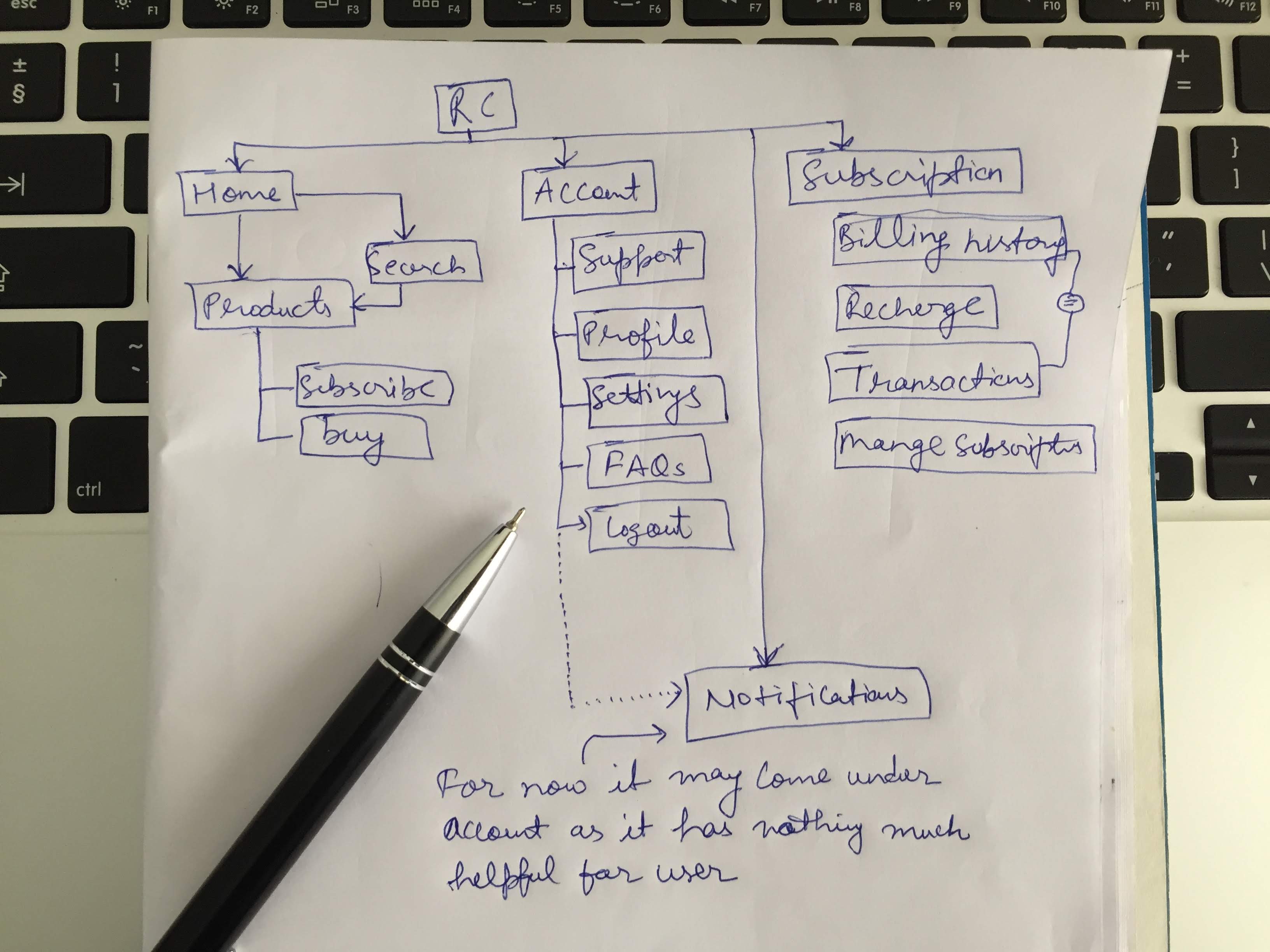
One of the core expectations of any system or product is discoverability. With Raincan app discoverability is not too bad that it can’t be used but certainly it is not user friendly. Managing your subscriptions, delivery schedule and balance should be little upfront than under my account. I made a few changes in IA before getting dirty into the sketches.
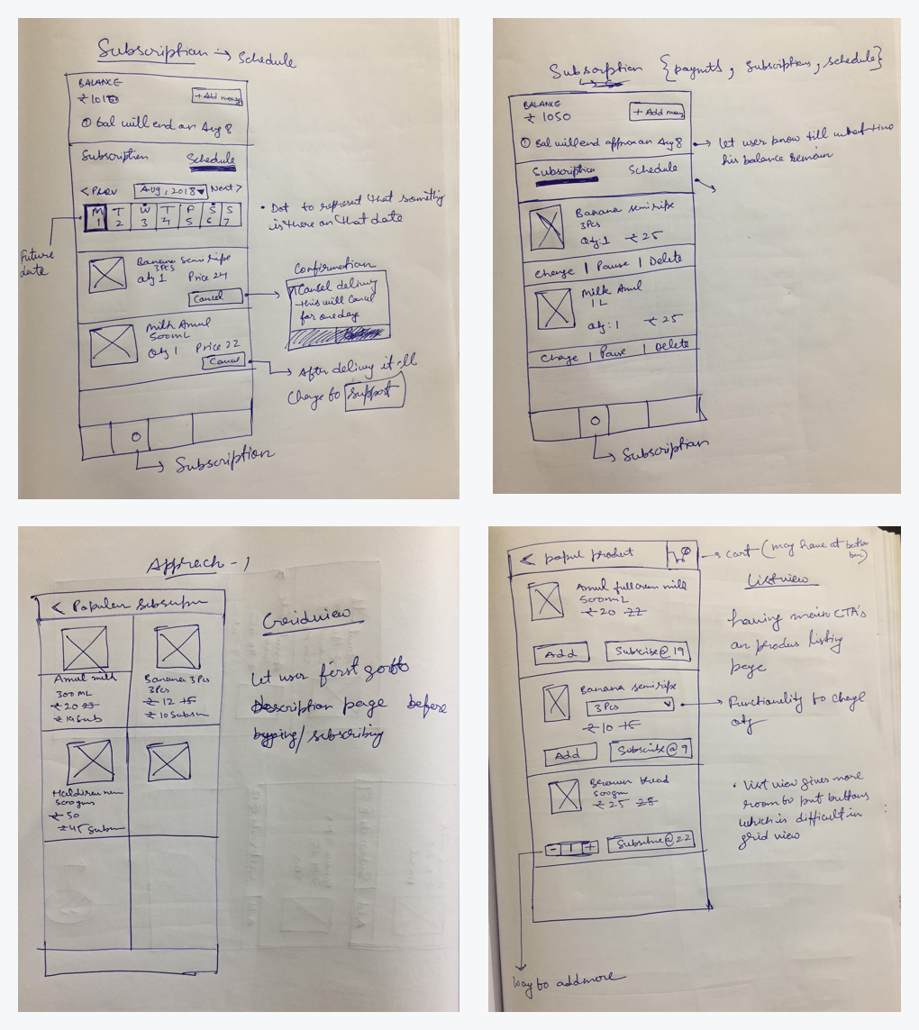
After gathering all insights from friends and my own review, I jumped into quick sketching based on IA I created. I tried a few different versions of some screens and compared with each other to finalise for visual design.
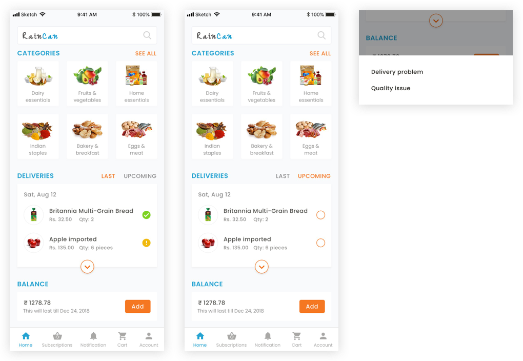
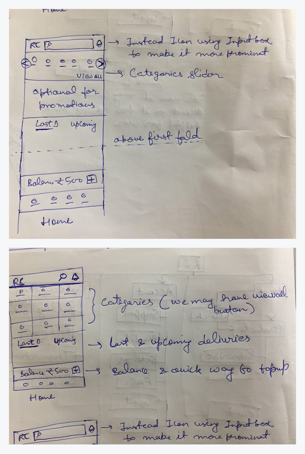
Given more priority to search and product categories. Now users can see their upcoming and last delivered products upfront, and in case of any delivery or quality issue raising a concern is easy. I Also brought wallet balance to the home screen considering adding a balance would be a frequent activity for user. Showing just a wallet balance might be useful in banking wallet apps but in this scenario there are recurring expenses. Showing users how long that balance will last will help them in taking wallet reload decision before time.
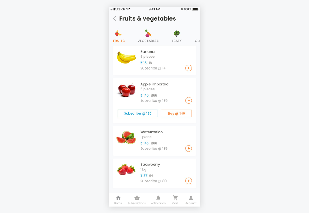
I used a full width card for list items considering there are two action buttons and their labels. To keep UI the clean and more scannable I kept the button hidden by default, but used a small plus icon to invite user for further actions. One problem I saw with existing design was user have to put little effort to understand things clearly about subscription and one time buy pricing. I decided to put pricing for both inside buttons to make things straightforward.
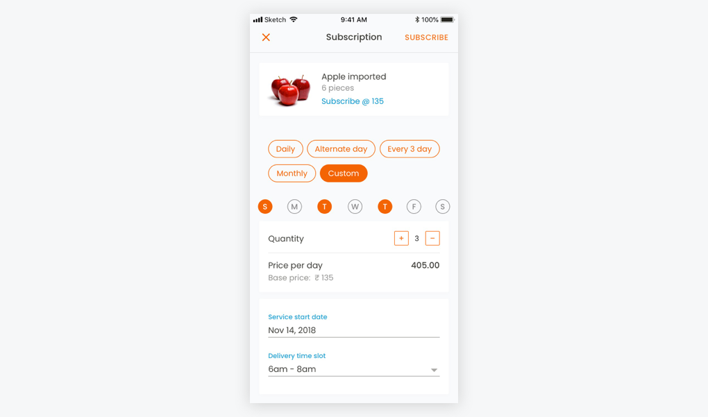
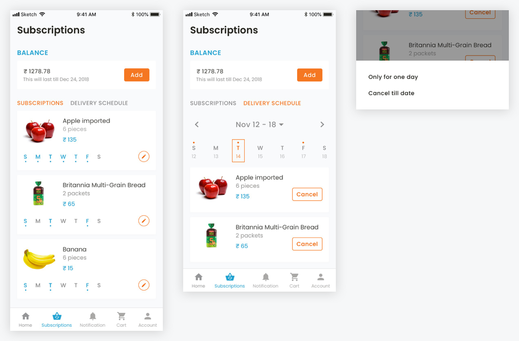
Along with subscriptions I’ve decided to add 2 more components to this page, balance and delivery schedule. Based on the discussions and small card sorting activity with people using the app, it made sense to put delivery schedule under subscription. For delivery schedule instead of using month calendar view I preferred weekly view as opposed to existing design, considering in most of the scenarios people plan for weeks instead of months. monthly view unnecessarily adds too much noise (big 30 cells grid). However I decided not kill the monthly view option completely, users can still access it by tapping on date, a little down arrow to indicate the same.
Having some design is better than no design. I can understand the scenarios where a young startup, having limited resources, building
great ideas but design in most of these scenarios is an afterthought. Hiring a freelance designer for a brief time would be far better
than having no designer at all.
Burning cash through online ads is not the only correct way to get downloads or more importantly active users. I loved the Raincan
strategy of pitching ideas at the right location and the right time.